If you’ve ever felt like you needed to poke your content with a stick just to see if it is still alive, then you probably haven’t been maximizing your calls to action. A solid call-to-action is the lifeblood of your content marketing efforts, but without magnifying the value of these CTAs, you’ll miss a lot of opportunities to move customers (and potential customers) into — and through — the marketing funnel.
The good news is that you don’t need to look far for great examples of irresistible calls to action to utilize in your marketing efforts.
Take a look at some of the best call-to-action examples from web pages, emails, videos and social media posts.
Website call-to-action examples:
1. Adidas

Adidas proves there is no need to make things complicated. A trip to its homepage includes a featured shoe accompanied by the simple invitation to “Shop Now.” Keeping it simple for your shoppers is one effective way to help them accomplish whatever it is they are seeking to do on your site.
2. E*TRADE
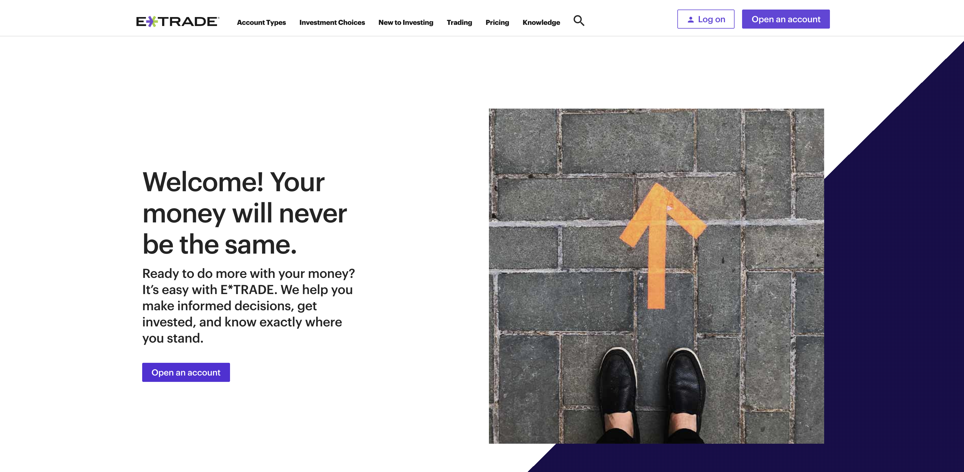
E*TRADE uses a mixture of a simple, yet explanatory opening paragraph and couples it with a simple call to action to explain to users what its service can do for users (help them make money), while simultaneously putting them at ease (“we help you”).
The combination of explanation and comfort helps set the stage for the simple “Open an account” call to action button that immediately follows.
3. American Red Cross
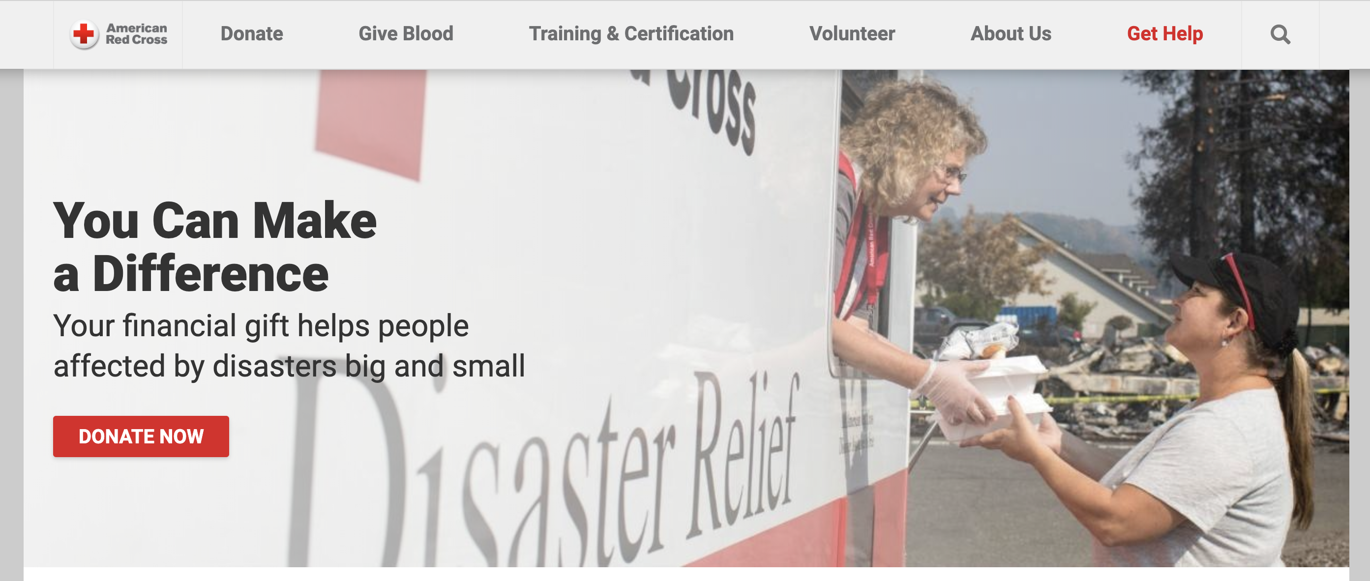
The juxtaposition of content on the American Red Cross website is a prime example of effective packaging around a call-to-action. First of all, the headline prepares and empowers users. The body text then provides additional context and information.
This all culminates in the displaying of the prominent and easy-to-find “Donate Now” button. All three features work with one another to create a stellar CTA.
4. Apple
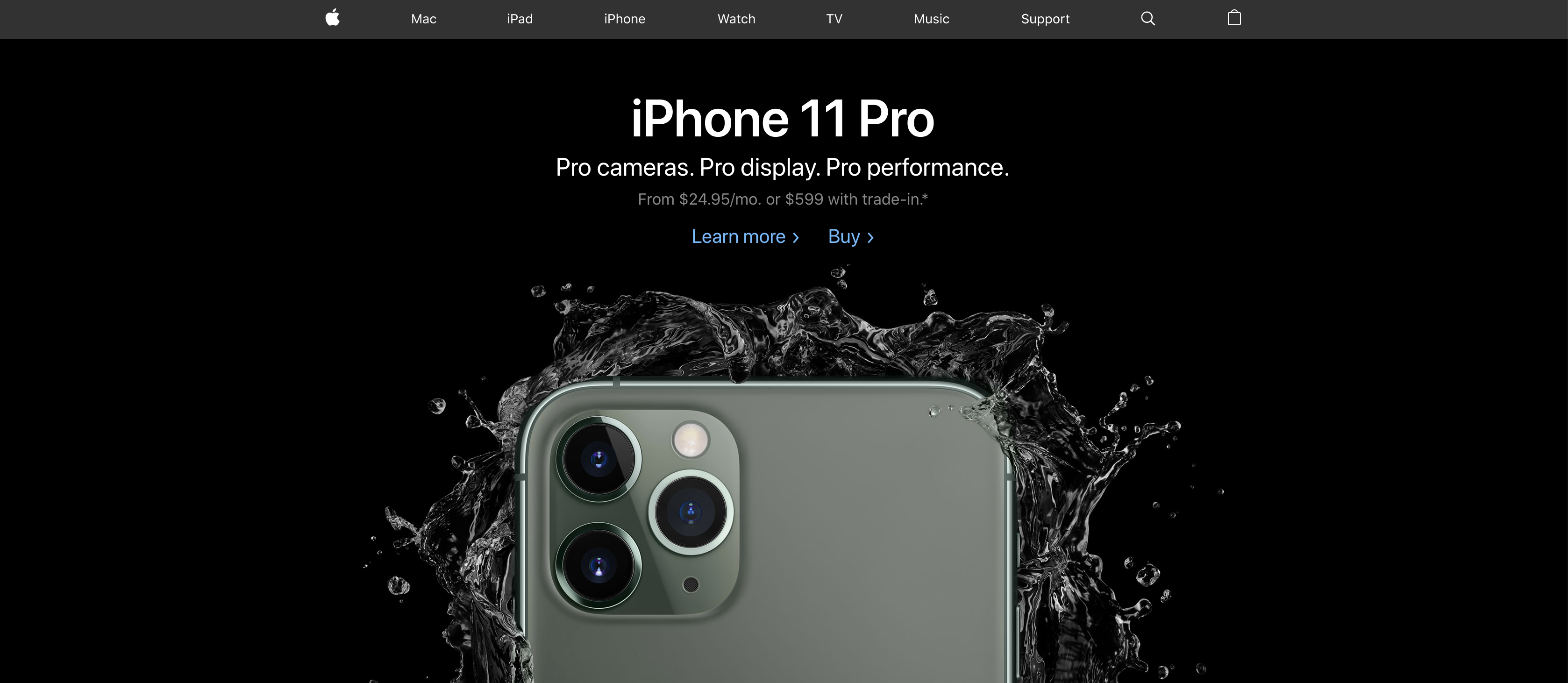
You already know Apple is all about simplicity. This extends from its products to its marketing efforts as well. The company could be tempted to have dozens of CTAs on its homepage. Instead, it opted for two.
First, “Learn more” helps educate and encourage potential consumers in their decision to buy an iPhone. Secondly, Apple understands many people already have their minds made up and they simply want to buy — so it gives consumers an easy way to do so.
The fact that the iPhone image is dominant and intriguing helps lead users’ eyes to the center of the screen — where the two CTAs are obvious.
5. General Electric
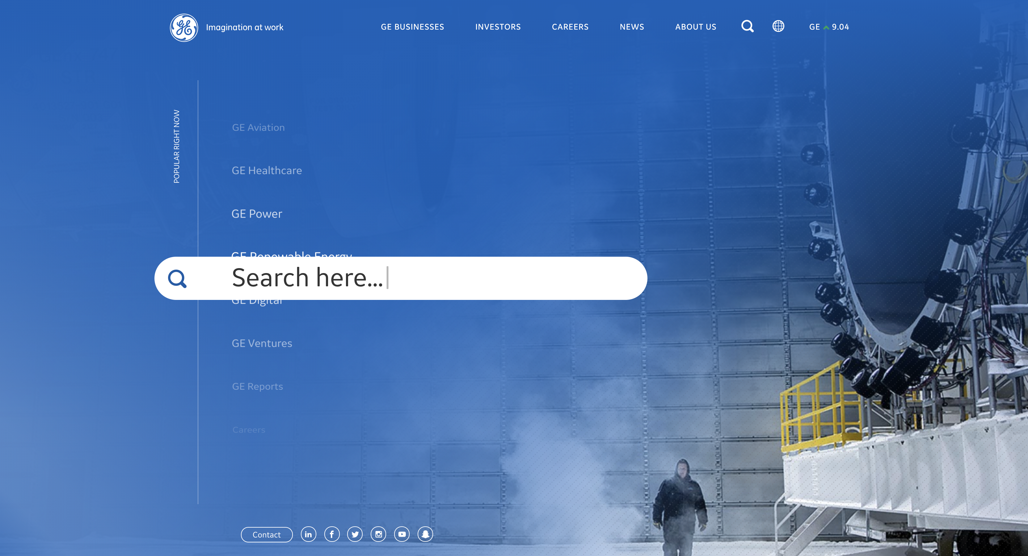
GE’s homepage is unique given that its prime call-to-action is an invitation to search. Most brands have a search functionality on their website but rarely does a brand embrace its search in its design the way GE does in this example. It is clear in this design that GE is investing in its search CTA as a prime way to educate, inform and influence customers and others.
Email call-to-action examples:
1. Southwest

This email from Southwest uses design elements to draw your eyes to the strong call to action. The header text makes it clear how far away the date is in which you can book your next trip and the body text (and the accompanying image) is a subtle nod that this time frame is right around spring break. The bold yellow box with the call to “Book now” CTA caps off the email.
2. LendingTree
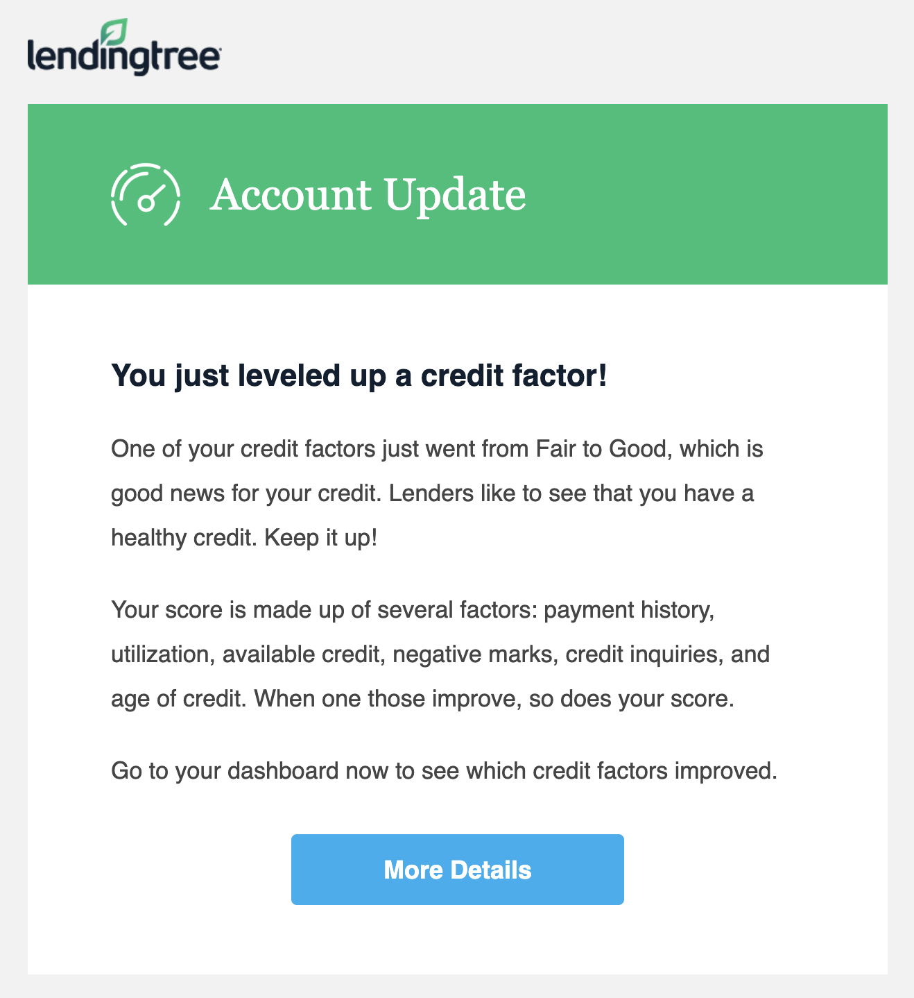
Sometimes you need to fight the urge to do too much. This email from LendingTree is a great example of less being more. There is no imagery. The design is very simple. There is only one button. A “designer” might want to do more, but in this case, there really is no need.
3. The New York Times
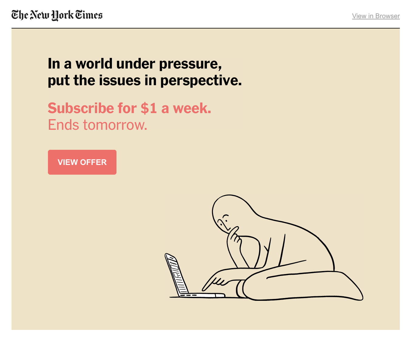
This short and simple email from The New York Times speaks about “the problem” it is trying to solve for those who receive it. Additionally, there is a sense of urgency (e.g. “ends tomorrow”) listed in the text that encourages the user to take an action. The pink font and button stand out from the tan background, making it easy for the user to see what the call to action is.
4. Xfinity

Typically, inserting too many calls to action in an email can be confusing for recipients, but in this case, Xfinity has minimized the possibility for confusion by ensuring that both calls to action on the screen link to the same deal.
Rather than confusing users, this tactic simply raises the likelihood that a user will get to the destination link. Like all good things, utilizing multiple CTAs that link to the same page should be done in moderation.
5. Redbox

Though the call-to-action button at the bottom of this email doesn’t look special, it is the wording of the CTA — paired with the overall goal of the email — that makes this an irresistible call to action. Redbox is clearly encouraging people to stream more content rather than rent physical DVDs.
By promising a free DVD rental at the top for those who stream a movie, then including the “Stream Now” button, the top and bottom of the email work together to invite users to try out streaming.
Video call-to-action examples:
1. Dude Perfect
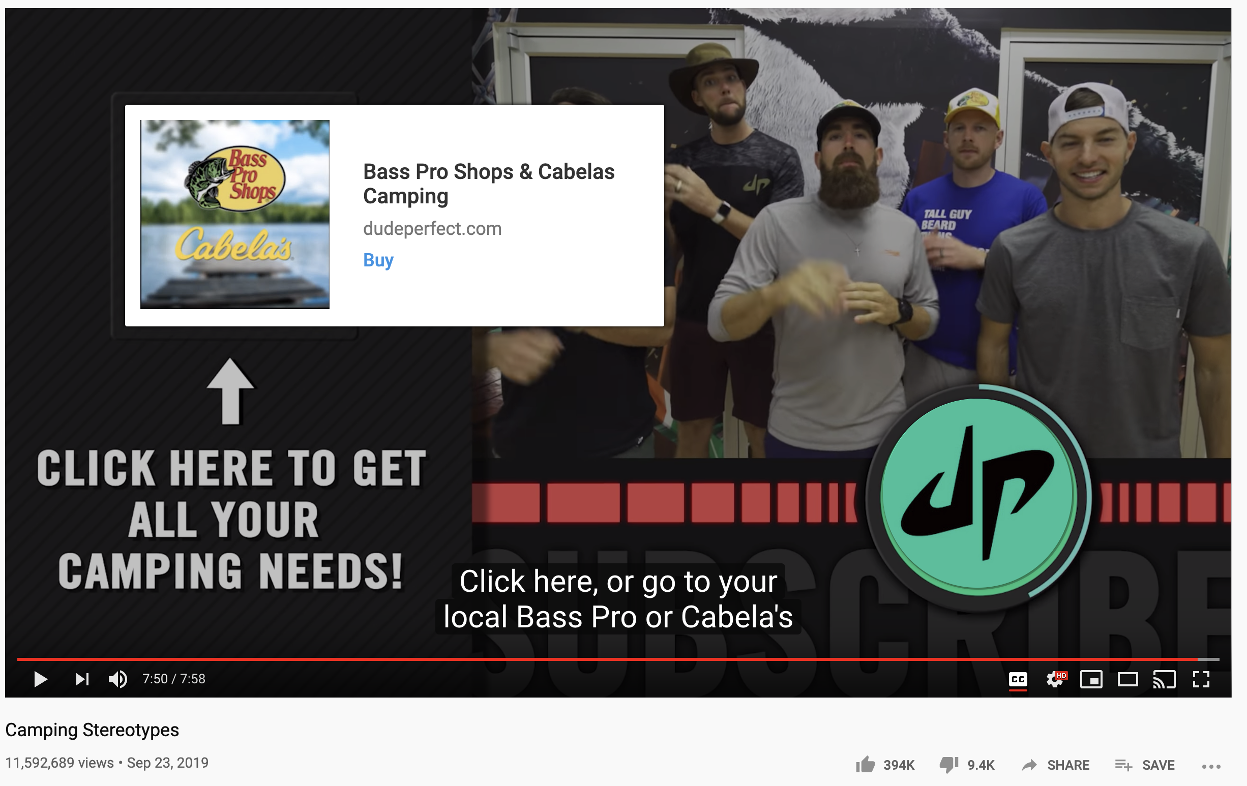
If you aren’t utilizing the tools that YouTube provides to you, you are missing out on some easy wins and call-to-action opportunities. In this example from Dude Perfect, the quintet throws in a link at the conclusion of its video to direct subscribers to the sponsor’s web site.
However, even more than that, they include a hard-to-miss “Click here . . .” call-to-action to make sure users see it.
2. Mark Rober

The CTA in your video doesn’t always technically need to be part of your video. Take for example this video from Mark Rober. Once he starts to direct people to his sponsor’s website, not only does he make the URL very obvious on the screen — but he also directs subscribers to the link in the video description.
3. Squarespace
Squarespace makes its invitation to consumers clear again and again throughout the course of this 60-second video — create. Once the company has made it clear that it can help its users create whatever they need to create for their businesses, it drives the message home with a voice and text CTA of “Create your own space at Squarespace.com” as the video concludes.
Social media call-to-action examples:
1. Spotify

In this ad, Spotify made sure to not do more than made sense given the platform where it was published. Instagram Stories are meant to be light, simple and easy-to-consume. With that in mind, Spotify developed this visually compelling ad that utilizes Instagram’s “Install Now” link at the bottom of the screen. This CTA — paired with the bold, welcoming statement at the top — makes this ad a great example of an Instagram story ad.
2. Shutterstock
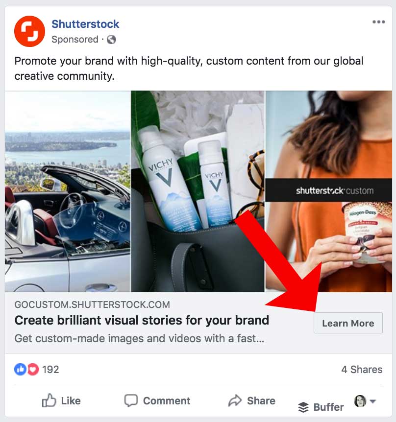
Shutterstock is one of many organizations that has utilized Facebook’s call-to-action button on sponsored posts on the platform. Brands who advertise with Facebook can add the “Learn More” button on sponsored posts to take users directly to a web page that further promotes the product or service being advertised.
Like the Instagram example above, this is another case in which advertisers need to utilize the tools social platforms give them rather than trying to think too far outside the box.
Are your CTAs converting?
If not, it might be time to recalibrate your content strategy. Creating an irresistible CTA can be the difference maker in your conversion rate. Whether you’re looking to punch up a few CTAs or overhaul your entire content creation to drive conversions, ClearVoice has you covered. Talk to a specialist today to learn how we can skyrocket your success.