You’ve written a phenomenal blog post (or email, landing page, etc.). The copy is insightful and compelling, and you’ve made great use of visual content. Maybe you even found a way to work some comedy in there. Excellent.
Now, what do you want readers to do next?
Every piece of content should have a call to action (“CTA” in marketing speak). Of course, you knew that. This is Digital Marketing 101 stuff. We should never let a piece of quality content run into a dead end. Always ask the reader to do something next.
This was great advice 20, even 10 years ago. It still is, but merely including a CTA is no longer enough.
Most users are onto us. Just like it’s become second nature for searchers to ignore the paid ad results, many users today simply gloss over that riveting “learn more” button. People don’t like being marketed to, especially when they’re being marketed to.
It’s time to get creative with your CTAs, folks.
This guide explains how to write an effective CTA and gives you 15 excellent CTA examples to consider as you create your own.
What makes a good call to action in marketing?
High-quality content naturally earns traffic, backlinks, and social shares. Once you get users to your site, strong CTAs are an important part of nurturing your target audience through the sales funnel.
A good CTA is clear, direct, and concise. When users ” follow the CTAs,” they should take a specific path you designed for them. Make sure to map your content and CTAs to the appropriate stage of the customer journey. For example, you wouldn’t offer a product demo (bottom-of-funnel content) to someone who just found you (a top-of-funnel user). Make your CTA appropriate for where they are in their journey with you.
These four tips will help you create an effective call to action:
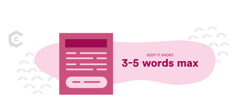
1. Keep it short
You have word count limits (albeit unofficial) because shorter CTAs are more effective. Keep your button/image CTAs to three to five words max. In the direst of circumstances, seven (but you should really need all those words).
For the record, virtually every industry peer agrees with us. A smattering of backup:
- Optimizely: “Most are no longer than five to seven words.”
- Neil Patel: “The more straightforward your point, the better.”
- Marketing Insider Group: “Keep your CTAs to no longer than four words if possible.”
In-text CTAs can be a smidge longer; more on those in tip #4.
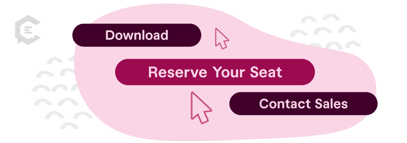
2. Use action words
With such limited space to play with, your words must be clear and decisive. Start with a strong verb or action-oriented phrase. Here are several we like:
- Download
- Order
- Buy
- Shop
- Subscribe
- Save
- Reserve your seat
- Submit
- Sign up
- Contact Sales
- Count me in
- Start your free trial
- Hear his story
- Shop our deals
- Get 50% off now
- Add to cart
- Get started
- Support
- Donate
- Volunteer
- Give
- Join
- Grab
- Claim
- Take advantage of
- Learn more
- See more
- See how
- Start
- Check it out
- Swipe up/right/left
- Schedule
- Book a demo
- Try for free
- Claim
We concede that not all great button text starts with a verb. Here is a handful we like that do not:
- Limited
- Last chance
- Sale ends tomorrow
- I want in/Count me in
- What we do
- Yes, I want ___

3. Pay attention to color and placement
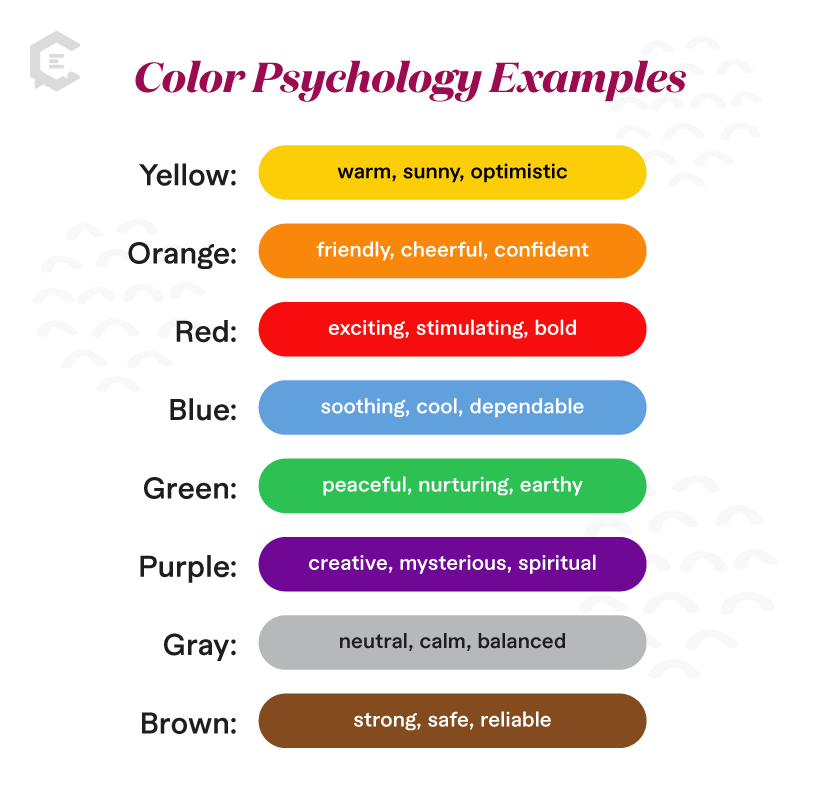
Your CTA should be a bright color that is highly contrasted to the surrounding real estate. We can’t make generalizations about which color is best for your site/industry/audience/goals—some swear by red, others by green or blue. You can look into the psychology of color (see sidebar) to learn which ones reportedly have which effects, but A/B testing will give you more reliable data.
How about placement? Above the fold is a no-brainer. Make it visible to the user without having to scroll, or try a “sticky” CTA that stays with users as they scroll. As far as the left or right side goes, we again suggest that you A/B test (or, if you’re feeling fancy, try multivariate testing).

The psychology of color is the study of how certain colors influence behavior. A wide body of research confirms that merely changing the color of a CTA button can increase conversion rates—but please take the following generalizations about color with a decent dose of skepticism. Personal factors such as gender and cultural differences influence color psychology as well. As mentioned, A/B testing will give you a better idea of what resonates with your readers.

4. Try anchor-text CTAs
Your call to action needn’t always be a button. Anchor text CTAs are just what they sound like—in-copy links that ask the reader to take the desired action. Here’s an example from our blog:

Make sure the anchor text clearly indicates what the destination page is. The reader should know where they’re going before they click—in the above example, I know I’m going to a “Contact us” page. Again, your CTA should be an appropriate next step for where your reader is in the customer journey.

How many CTAs should you have in a piece of content?
Great question. It depends on the nature of the page. You don’t want to pepper your page with so many competing CTAs that you overwhelm the reader. Like much of life, people will bail if things get too complicated. Here are some good guidelines:
- Homepage. The one place it’s OK to have multiple CTAs. This is the front page of your brand, so it makes sense to offer them many doors to the rest of the site.
- Product pages. 3-4—one to buy now, one to learn more/talk to someone, and one to see related items.
- Blog posts. 3-4—one to helpful, relevant content; one to subscribe to your newsletter; and a combo button/anchor-text CTA at the end of the post.
- Landing pages. 1. That’s it. Get them to convert.
- Email. 1-2. What’s the primary purpose of the email? Make that the more prominent CTA. Due to the more personal nature of email, brands often include an anchor-text CTA that points the reader to a helpful piece of content (but doesn’t sell to them).
Your brand is fighting for eyeballs and clicks in a limited-attention-span world. Lead potential customers down the path to conversion with strong, decisive CTAs. Here are 15 CTA examples we like:
Website call-to-action examples:
The following CTAs are strong, simple, and clickable. There’s no doubt what step these brands want users to take next.
1. Adidas
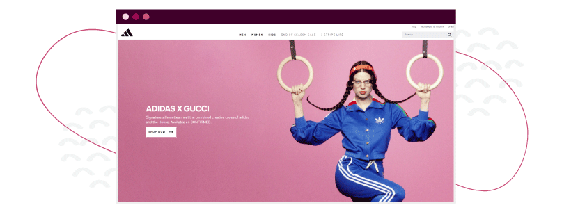 Adidas proves there is no need to make things complicated. A trip to its homepage includes a featured shoe accompanied by a simple invitation to “Shop Now.” Keeping it simple for your shoppers is one effective way to help them accomplish whatever it is they are seeking to do on your site.
2. E*TRADE
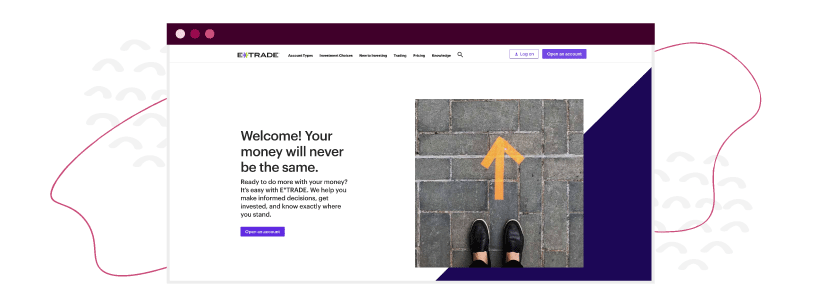
E*TRADE uses a mixture of a simple yet explanatory opening paragraph and couples it with a simple call to action to explain to users what its service can do for users (help them make money) while simultaneously putting them at ease (“we help you”).
The combination of explanation and comfort helps set the stage for the simple “Open an account” call-to-action button that immediately follows.
3. American Red Cross

The juxtaposition of content on the American Red Cross website is a prime example of effective packaging around a call-to-action. First of all, the headline prepares and empowers users. The body text then provides additional context and information.
This all culminates in the displaying of the prominent and easy-to-find “Donate Now” button. All three features work with one another to create a stellar CTA.
4. Apple

You already know Apple is all about simplicity. This extends from its products to its marketing efforts as well. The company could be tempted to have dozens of CTAs on its homepage. Instead, it opted for two.
First, “Learn more” helps educate and encourage potential consumers in their decision to buy a MacBook Air. Second, Apple understands many people already have their minds made up, and they simply want to buy, so the second button goes straight to pricing. Smart.
5. General Electric
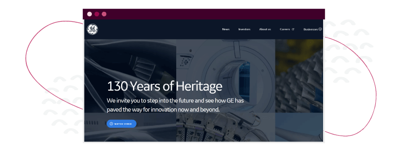 GE’s homepage is unique in that its prime call-to-action is an invitation to watch a video. HubSpot knows why: Nine out of 10 people want to see more videos from brands and businesses. GE has embraced that by putting a video on its homepage, supporting the notion that a CTA to watch a video is a good way to inform and influence customers and searchers.
Email call-to-action examples:
Next time you’re creating an email campaign, think of it this way: Your email is the beginning of a conversation with the user, and the CTA is the entire point behind the conversation. What do you want readers to ultimately do, and subsequently, what steps get them there? Then form your CTAs using this information.
1. Southwest
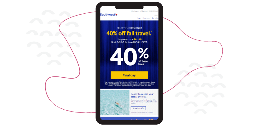 This email from Southwest employs three different CTAs in a sleek, simple design that doesn’t overwhelm the reader. Notice how the CTAs follow a natural order: The first one creates a sense of urgency (“Final day”), the second piques the reader’s curiosity (“There’s an offer? Just for me?”), and the final is a firm “Book now.”
2. LendingTree
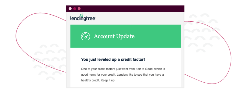
Sometimes you need to fight the urge to do too much. This email from LendingTree is a great example of less being more. There is no imagery. The design is very simple. There is only one button. A “designer” might want to do more, but in this case, there really is no need.
3. The New York Times
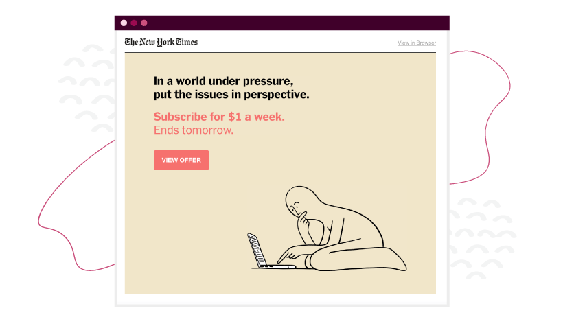
This short and simple email from The New York Times speaks about “the problem” it is trying to solve for those who receive it. Additionally, there is a sense of urgency (e.g., “ends tomorrow”) listed in the text that encourages the user to take action. The pink font and button stand out from the tan background, making it easy for the user to see what the call to action is.
4. Xfinity

Typically, inserting too many calls to action in an email can be confusing for recipients, but in this case, Xfinity has minimized the possibility of confusion by ensuring that both calls to action on the screen link to the same deal.
Rather than confusing users, this tactic simply raises the likelihood that a user will get to the destination link. Like all good things, utilizing multiple CTAs that link to the same page should be done in moderation.
5. Redbox
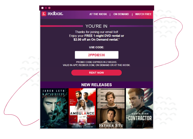
Redbox expertly combines its “thank you for subscribing to our newsletter” email with a natural call to action for someone who just signed up—”rent now.” Yes, thank you, that’s precisely what I wanted to do next in this stage of my buyer’s journey. Combine that with a coupon code (“I like saving money!”), and this is a strong CTA.
Video call-to-action examples:
This is no surprise: YouTube is pretty crowded these days. If you’re publishing your brand videos on this platform, make sure to include a CTA that gets viewers to your website. These videos got it right.
1. Dude Perfect
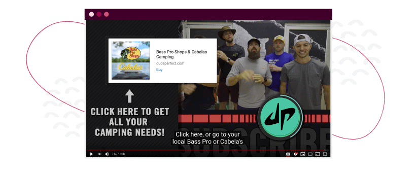
If you aren’t using the tools that YouTube provides you, you are missing out on some easy wins and call-to-action opportunities. In this example from Dude Perfect, the quintet throws in a link at the conclusion of its video to direct subscribers to the sponsor’s website.
However, even more than that, they include a hard-to-miss “Click here . . .” call-to-action to make sure users see it.
2. Mark Rober
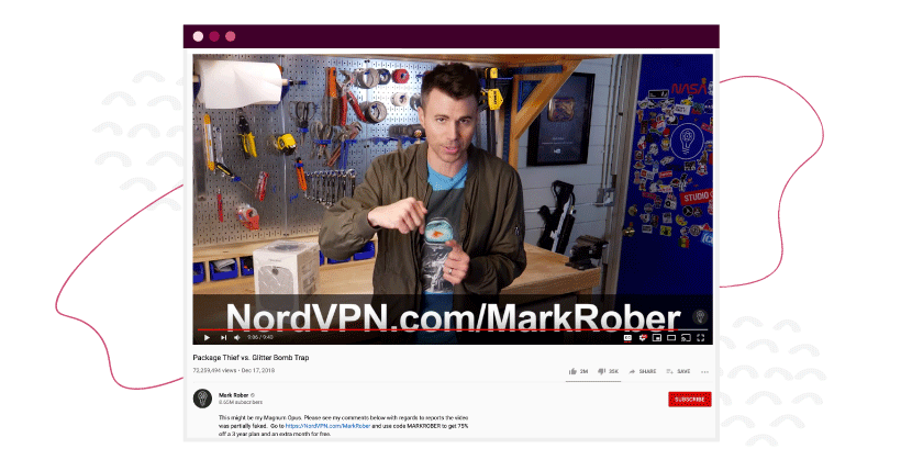
The CTA in your video doesn’t always technically need to be part of your video. Take, for example, this video from Mark Rober. Once he starts to direct people to his sponsor’s website, not only does he make the URL very obvious on the screen — but he also directs subscribers to the link in the video description.
3. Squarespace
Squarespace makes its invitation to consumers clear again and again throughout the course of this 60-second video — create. Once the company has made it clear that it can help its users create whatever they need to create for their businesses, it drives the message home with a voice and text CTA of “Create your own space at Squarespace.com” as the video concludes.
Social media call-to-action examples:
The immediate nature of social media makes it perfect for injecting a little FOMO (fear of missing out) into your CTAs. You can promise users free shipping, early access to sales, special coupons, exclusive access to content, and more.
1. Spotify
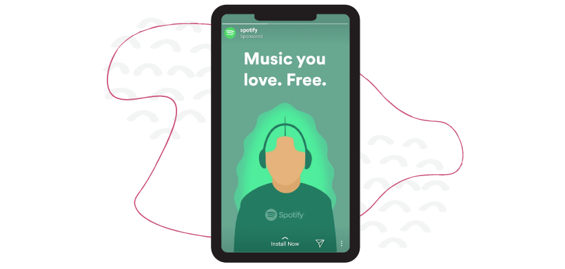
In this ad, Spotify made sure not to do more than made sense given the platform where it was published. Instagram Stories are meant to be light, simple, and easy to consume. With that in mind, Spotify developed this visually compelling ad that utilizes Instagram’s “Install Now” link at the bottom of the screen. This CTA — paired with the bold, welcoming statement at the top — makes this ad a great example of an Instagram story ad.
2. Shutterstock
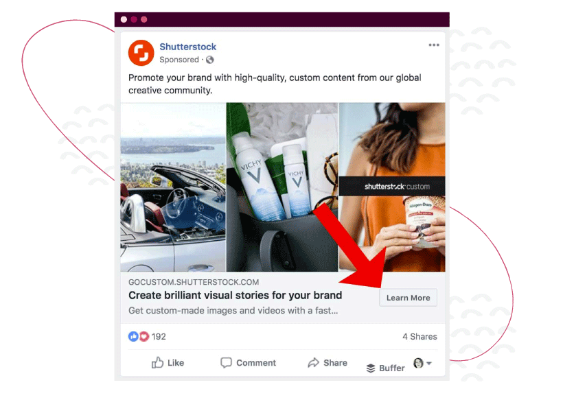
Shutterstock is one of many organizations that has utilized Facebook’s call-to-action button on sponsored posts on the platform. Brands who advertise with Facebook can add the “Learn More” button on sponsored posts to take users directly to a web page that further promotes the product or service being advertised.
Like the Instagram example above, this is another case in which advertisers need to utilize the tools social platforms give them rather than trying to think too far outside the box.
Increase conversions with content
Your ideal users found you online—awesome. Make sure your content has strong CTAs that are appropriate for where the reader is in their journey with you and clearly tell them what to do next. The idea is that you’ll lead them down the digital path to conversion.
Need help? ClearVoice can source producers, editors, writers, designers, strategists, and SEO experts—everyone you could need to produce engaging content that gets results. Talk to a content specialist to see how we can help your brand.