Landing pages are the front door to your business-to-business (B2B) brand. They set the tone for how buyers perceive your product, credibility, and value. Yet, too many landing pages fail to convert — not because the product is weak or the design outdated, but because the messaging is vague and disjointed.
That’s where landing page optimization comes in.
The biggest roadblock? The stakeholder quilt effect — a patchwork of content stitched together by product marketing, content, conversion teams, and executives. Instead of clarity, buyers see noise. With insights from Tas Bober, founder of The Scroll Lab, we’ll explain why misaligned teams derail landing pages, and how to use a buyer-first approach to optimize them for clarity, credibility, and conversions.
The “Stakeholder Quilt Effect” Explained
The stakeholder quilt effect is when a landing page is created with multiple competing perspectives. Basically, each department stitches in its own “patch” of content:
- Product marketing contributes to messaging frameworks
- The content team adapts copy to the brand voice
- Conversion content specialists insert urgency and call-to-actions (CTAs) that encourage a response
- Executives add their personal preferences
On the surface, the page looks complete, but instead of a clear, persuasive story, the buyer sees a patchwork of conflicting priorities.
“The issue with most B2B landing pages is they’re just a bunch of stakeholder management opinions,” Bober says. “Everybody’s got their own framework, their own point of view. The buyer ends up scrolling through a quilt instead of a clear narrative.”
This effect isn’t just inconvenient; it’s costly. Disjointed landing pages fail to connect with executive buyers, resulting in missed conversions, wasted ad spend, and a lower return on investment (ROI) for campaigns.
Symptoms of a Patchwork Landing Page
The following B2B landing page problems frustrate buyers. Instead of answering their core questions — “Why should I care?” and “What’s next?” — the page forces them to wade through noise.
Here are the telltale signs your landing page suffers from the stakeholder quilt effect:
- Inconsistent tone and copy: One section is conversational, while another is weighed down with jargon. It feels like multiple authors wrote different pieces.
- Conflicting CTAs: One block urges visitors to book a demo, another promotes a white paper, and a third highlights a free trial. Instead of clarity, buyers see competing priorities and are unsure which route to take.
- Overstuffed with features: 36% of decision-makers look to websites for buying insights and conversion content. But if every stakeholder adds to the list, the result is often more overwhelming than helpful.
- Multiple messaging frameworks: A product-focused value prop may contradict your brand story, or a conversion team’s direct-response pitch. Misaligned messaging signals a lack of strategic focus.
- Design clutter: Extra elements crammed onto the page break visual flow and hurt readability.
Why Landing Page Misalignment Happens: Internal Politics vs. Buyer Needs
The root cause of the quilt effect is simple: internal politics outweigh buyer needs.
Every team has good intentions. Product marketers want accuracy, content strategists want voice consistency, sales leaders want leads as quickly as possible, and executives want their vision reflected. When each voice operates independently, the buyer loses direction in their journey.
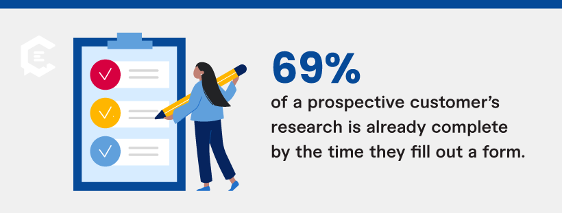
Conversion data is a poor indicator of success. By the time a prospective customer fills out a form, they’ve already done about 69% of their research. The real challenge is helping them consume information while they investigate your brand. With strategic search engine optimization (SEO), you can attract potential buyers to your landing page, and then rely on your clear communication to guide them to a decision.
When you build B2B landing pages to appease stakeholders rather than inform buyers, you miss the opportunity to lead buyers on a clear pathway. Visitors leave without answers, while teams blame design or traffic issues — when the real culprit is misaligned messaging.
The Solution: A 4-Step Framework for Buyer-Centered Landing Pages
The fix is simple: Build B2B landing pages around the buyer, not the stakeholder.
As Tas Bober explains, the best approach is to treat your landing page like a business case — something the buyer can use internally to justify their decision. That shift keeps the page focused, credible, and conversion-ready.
Follow this four-step landing page optimization framework:
Step 1: Conduct a Buyer Business Case Exercise
Before writing copy, answer these core buyer-related questions:
- What’s the buyer’s current alternative — manual workflows or a competitor?
- What primary problems are you solving?
- What are the top two or three use cases your product addresses?
- What objections come up most often in sales calls?
- What social proof or peer validation will matter most to them?
- What does the pricing conversation look like (even if you only share ranges)?
Answering these upfront creates a foundation of alignment for your team. Instead of a patchwork approach, everyone works from a unified buyer-first strategy.
Step 2: Align Messaging with Product Marketing and Content
Once the business case is clear, translate it into messaging:
- Executive buyers may need more detailed proof to help them along the purchase funnel.
- Marketers may prefer skimmable clarity and quick takeaways.
Your buyer’s needs should anchor the message regardless of the format. When all voices support a consistent narrative, you achieve content depth that aligns with search intent and guides buyers smoothly through the sales funnel.
Step 3: Prioritize Proof, Objections, and Clarity
Buyers want proof, transparency, and reassurance before they invest in your service or product. When they know who you are and feel fully informed, this builds your authority and reputation in their eyes.
Here’s how to achieve it:
- Add social proof to your landing page in the form of testimonials, case studies, and third-party reviews.
- Address objections and concerns directly in an FAQ section. In one case, Bober shared a heat map revealing how a single FAQ drew the most clicks on a landing page. The team then turned it into its own dedicated block, and conversions increased by 265%.
- Be upfront about pricing. Even a “starting at” range builds trust compared to no mention of pricing at all.
Step 4: Treat Reviews and Approvals with Caution
Finally, avoid falling back into quilt territory during internal reviews.
Here’s how:
- Evaluate every edit through the buyer’s lens.
- If a suggested change doesn’t serve the buyer or contradicts the core narrative, it doesn’t belong.
This turns review from subjective debate into objective buyer alignment.
B2B Landing Page Optimization Checklist
If you already have existing landing pages that are more “patchwork quilt” than purposeful buyer journey, don’t worry. This landing page optimization checklist will help you align every element around clarity and conversion.
Here’s how to audit and fix your existing landing pages:
- One primary CTA (with an optional secondary for lower-intent visitors)
- Clear problem/solution framing that reflects buyer needs.
- FAQs addressing common issues encountered during sales calls
- Transparent pricing signals (ranges or starting points at minimum)
- Social proof in the form of customer testimonials, peer reviews, or case studies
- Consistent tone across all sections, aligned to the buyer
- Analytics and heatmaps to measure content consumption and to identify drop-off (bounce) points.
- Streamlined navigation that supports the page flow without unnecessary distractions.
Run this audit regularly to uncover hidden quilt effect issues. Use A/B testing to determine which tones and messages resonate most effectively with your audience.
Your ultimate goal: clear, buyer-centered landing page optimization that drives conversions.
From Patchwork Mess to Landing Page Success
The stakeholder quilt effect is common in B2B, but it’s not inevitable. Landing pages don’t fail because marketers lack creativity. They fail when too many internal voices drown out the buyer’s needs.
By shifting focus — building a buyer business case, aligning messaging, prioritizing proof, and streamlining reviews — you can turn patchwork pages into purposeful, buyer-first assets.
That’s the power of effective landing page optimization: clear messaging that guides buyers, builds trust, and drives conversions.
Ready to replace patchwork with purpose? We provide managed content solutions that include everything from content strategy and buyer-focused copy to search intent alignment and SEO. Connect with an expert content strategist to learn more.