What is a heatmap? A heatmap is a quick and inexpensive visualization tool that uses color scales to show how visitors are interacting with your content, helping you to gauge overall page performance.
Sometimes, you don’t want a complex way to see how well a page or piece of content is doing. That’s where a heatmap comes in. Easy to understand, thanks to its simple color coding, this vibrant tool shows how users are engaging with each individual detail.
Whether it’s internal or external links or call-to-actions (CTAs), a heatmap will show you which parts of your content are getting the most attention and which are being completely ignored. The warmer the color (reds, oranges, and yellows), the higher the traffic.
Blues and greens, meanwhile, signal low-activity areas.
Coined by finance entrepreneur Cormac Kinney in the ’90s, heatmaps were designed to help stockbrokers easily spot opportunities to buy and sell.
Now, they help content marketers decide how to best lay out their content to encourage reader retention and boost conversions. Different types of heatmaps exist. Some track where users click, while others see how far down a page visitors really scroll.
Ultimately, they’re an efficient way to pick out content that’s not performing so well and redesign it to keep readers engaged. You can also use them to determine well-optimized content, providing a blueprint for future marketing plans.
Why would you use a heatmap?
- To help uncover the content that’s performing well and the content that needs a helping hand
- To increase conversions by altering your page layout, including removing elements that cause confusion or abandonment
- To optimize images and CTAs so that users remain engaged
- To strengthen your internal and external linking strategy
- To determine how long your content should really be
- To quickly and easily gather data from a significant number of web or mobile users
3 heatmap examples
1. Hover maps
Hover maps track where users move their mouse and pause, so you have an idea of where they’re looking on a page.
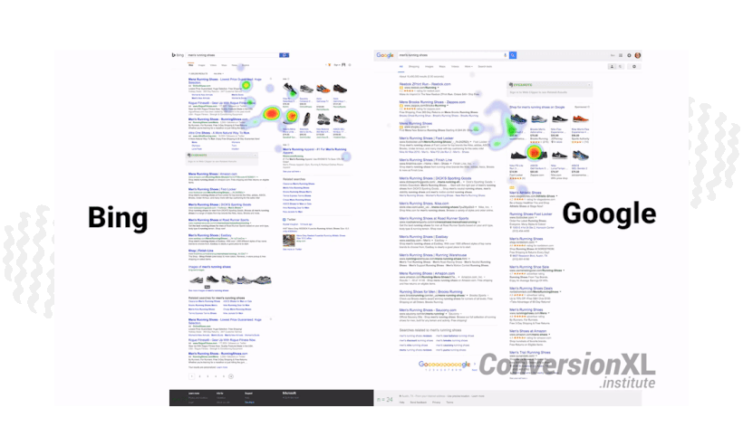
2. Click maps
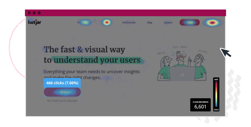
Click maps show where visitors click or tap on a page, helping you know where to place links and CTAs. A confetti report allows you to see individual color-coded clicks, whereas an overlap report shows clicks as percentages.
3. Scroll maps
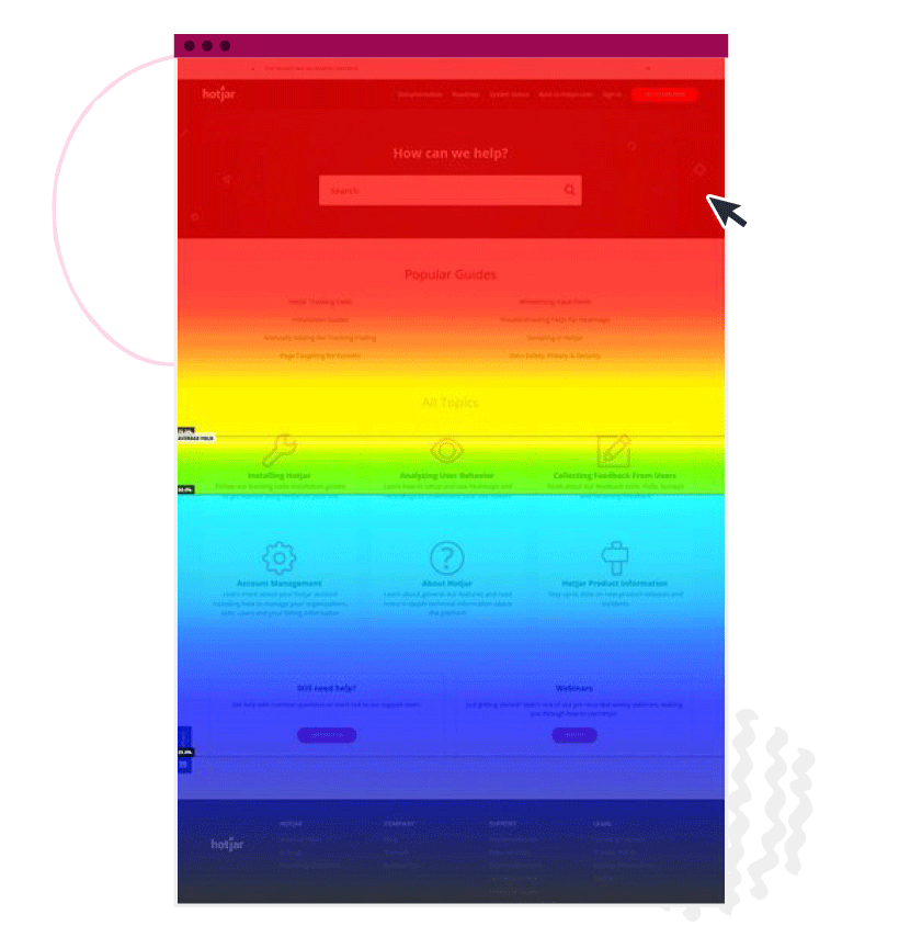
Scroll maps show you how far users actually scroll down a page, so you have a better idea of content length and how far up to place important information.
Get high-quality content developed so you can see what topics, CTAs, headlines, and copy work best for your audience. Talk to a content specialist at ClearVoice today.