What is responsive design? A website that automatically adapts to the device it’s being viewed on — whether it’s a computer, tablet, or smartphone — for a greater user experience.
Whether it’s searching Google in the bathroom or scrolling through social media sites before bed, many people access content through their phones. But not all content is mobile-friendly, turning a user off within a matter of seconds.
Responsive design is the answer to high bounce rates and dissatisfied mobile visitors. Before, many companies would spend serious time and money creating separate websites for each device (or just hope that a potential customer wouldn’t mind viewing a desktop layout on a phone).
Some companies still do. But many are starting to opt for a more efficient website design that automatically changes menus, fonts, and images to suit the various screen sizes of mobiles, tablets, and devices that are yet to be invented.
A mobile-first approach is crucial
Smartphone users don’t want to have to zoom in or scroll way, way down to read blogs or click on links. So when it comes to content, a mobile-first approach is now key. Streamline your content so that it’s snackable with the most important information available at the top. Then, when it comes to desktops and laptops, you can add more detail where needed.
A responsive design is also vital for SEO. Back in 2015, Google began boosting the ranking of phone-friendly pages in its mobile search results.
In a nutshell, if you avoid optimizing your site and content for every kind of user, you could lose out on the brand awareness and conversions that you’ve been working so hard to build.
The advantages of responsive design
- To improve search engine ranking
- To reduce user bounce rate
- To increase your return on investment (ROI) by making it easy for all device users to share and buy
- To widen your audience
- To save time and costs both now and in the future
- To create a positive brand recognition
3 responsive website examples
1. Dropbox
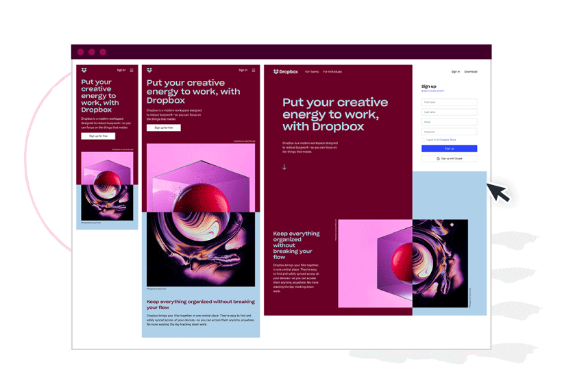
Fonts, images, and colors change when you switch from the desktop site to the mobile version. The company has also included a clear sign-up button on the mobile site instead of taking up room with the full form.
2. Wired
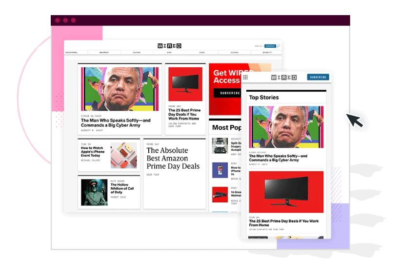
Simplified mobile site sees the day’s most important stories neatly arranged at the top with a drop-down menu rather than a full top bar.
3. BMW
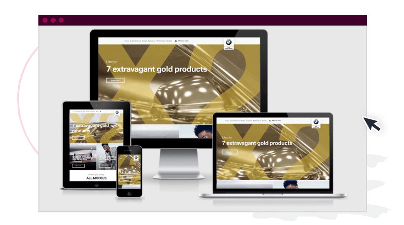
Images and call-to-action buttons are nicely resized for prominence across all four versions of the car manufacturer’s site.
Get high-quality, mobile-friendly content created for your brand by talking to a content specialist at ClearVoice today.


