Content comes in a variety of formats and flavors. But, when it boils down to it all, there are two basic types of content: Written and visual. Both are self-explanatory; written content consists of articles, ebooks, white papers, and case studies.
The visual counterpart offers memes, videos, images, and presentations. Also in the visual content category? Infographics and data visualizations.
2 types of visual content and how to use them
In fact, infographics are often confused with data visualizations; they’re often lumped in the same category.
While both use visuals to get their points across, they aren’t the same. They’re used for different purposes, require different creation techniques, and have different uses.

1. Data visualizations
Data visualizations are graphical representations of numbers and information through the use of visual elements such as charts, graphs, tables, and maps. This type of visual content helps your audience see data trends and patterns.
Many content marketers and creators are using data visualization because big data is becoming more prevalent when it comes to business and decision-making. As such, using statistics can help boost your storytelling content and add credibility to your article, blog, or other written pieces.
Big data is one thing. Putting numbers in your content just to do it is another. Let’s take a look at the following data, courtesy of the Real Estate Center at Texas A&M University.
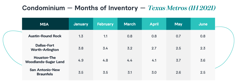
Use tables to highlight important numbers
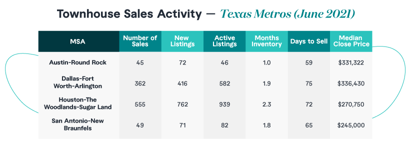
The table above offers information about condominium sales in Texas’ four major cities during June 2021. The second table, below, is also condo-centric, focusing on inventory data from January through June 2021.
For the non-real-estate experts out there, months of inventory detail the number of months it takes to sell all condos on the market at the average monthly sales price.
This data could be part of a blog or ebook, which might be of interest to real estate agents or realtors. But these professionals are very busy people, and they might not have the time or patience to look at all of these numbers or understand what they mean in the overall scheme of things.
This is where data visualization tools can help. Let’s put information about median sales prices in a graph and see what we get.
Use charts and graphs to help your audience identify trends and gain insights
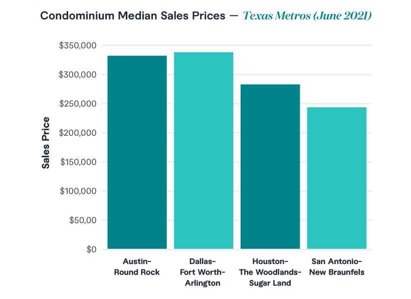
This tells us that Dallas-Fort Worth-Arlington had the highest median sales prices when it came to condo sales in June 2021. This “comparison” information isn’t readily available in the above-referenced table.
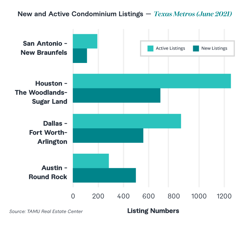
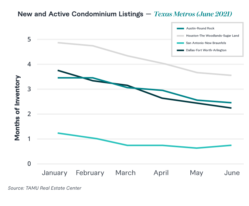
Meanwhile, the “New and Active Condominium Listings” below tells us that Houston-The Woodlands-Sugar Land MSA has the highest number of active listings.
A realtor in this metropolitan statistical area (MSA) can look at this information, understand that there is a good deal of inventory available and price their offerings accordingly.
Speaking of inventory, the line graph below lets us know a few things. First, Austin-Round Rock has the lowest “months inventory,” meaning condos are selling pretty quickly there.
Second, the number of months of inventory in all Texas metros showed a decline from January 2021 through June 2021. This suggests a growing demand throughout Texas for condos. This could be great news for realtors in Texas.
The examples above demonstrate some pretty nifty benefits of data visualization tools. They help your audience identify trends and issues that might get lost in the numbers. This can help spur decisions and create faster insights and understanding of what you’re trying to convey.
Types of data visualization and when to use them
Getting your data points across requires more than throwing a bunch of numbers into Excel or other software and hoping for the best. First, it’s important to know which data visualization tool to use and at what time. Here’s a basic rundown.
- Column charts and bar charts demonstrate comparisons across categories
- Line charts and area charts depict a data change over a period of time or interval
- Pie charts show classification proportions
- Maps are useful for showing data distribution
Best practices for creating data visualization content
Ensure you create great data visualization content by following these best practices:
- Clearly represent data points. Be sure your audience understands the categories and information you’re attempting to present. Keep your axis labels short and sweet.
- Don’t overload your visualization with unimportant data. Avoid the “spaghetti look” in your line chart and cut back on the slices in your pie chart.
- Use up-to-date information. Be sure your material is as current as possible (and always indicate the period of time).
- Be careful with colors. While it might seem like a great idea to throw in a bunch of vibrant colors to force your visualization tool to stand out, resist the temptation. Instead, using complementary color palettes and/or different shades of the same color can do a better job of getting your meaning across.
- ALWAYS source your data. Let your audience know where the data came from and, when possible, link back to that source.
Charts, graphs, and maps are great for helping your audience make sense of numbers through visual content. But an important takeaway here is that data visualization tools are NOT infographics.

2. Infographics
Infographics combine “information” and “graphics” to create a visual device. Basically, the goal of an infographic is to share information through visual means. So, why is this any different from data visualization?
While your charts, graphs, and maps introduce big data in easy-to-understand formats, an effective infographic is:
- Useful in that it helps your audience to put information into context
- Accurate in that it presents complex information in easy-to-digest, highly visual formats
- Meaningful in that it introduces ideas through compelling and memorable designs
Taking this one step further, an infographic might offer a data visualization tool or three to tell its story. Many do. But infographics also focus on so much more.
Speaking of Texas condos (back to that, again), here is another visual. This also includes extra information about townhome sales in Texas. This infographic compares these two types of housing, while also comparing information across metropolitan statistical areas.
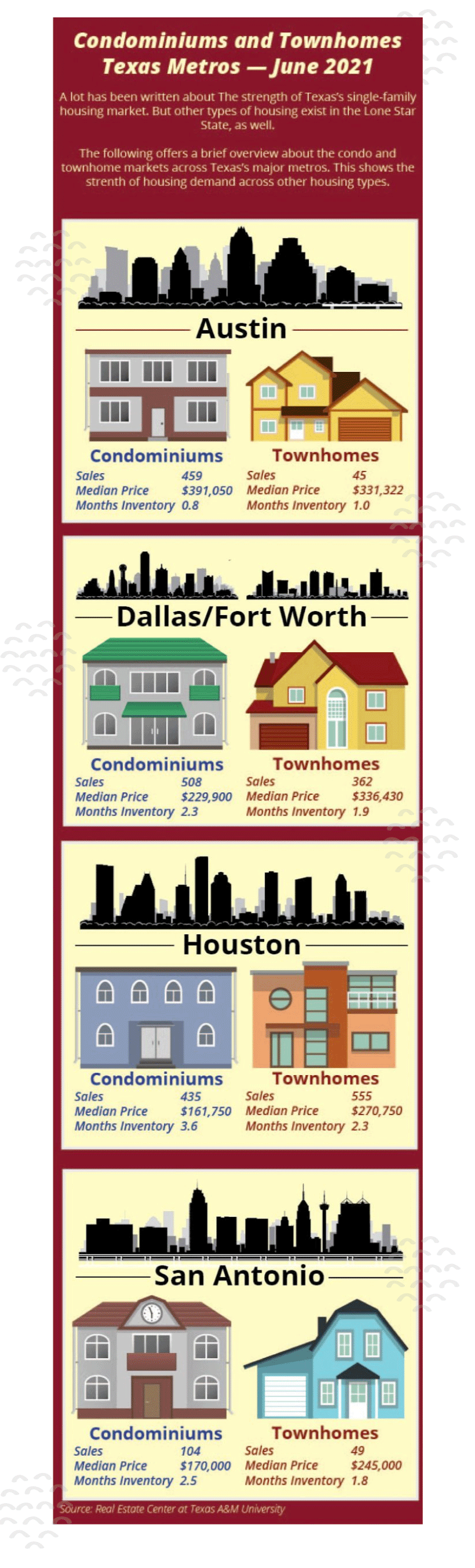
Thanks to the layout and use of visuals and colors, the information is presented so that it’s easy to read and take in. This increases the likelihood that your audience of realtors and real estate agents will find it useful.
Along those lines, well-developed infographics are shareable. It’s not out of the realm of possibility that an Austin realtor might find the above interesting enough to share on their website or social media post. This shows their audience that they’re following condo and townhome trends. Because of this, it’s important to have the name of your company and a link (if possible) somewhere on your infographic.
Speaking of company names, an infographic can also be a terrific branding tool. Many content marketers develop infographics with specific brand standards, colors, and fonts. This nicely ties the piece to the company brand.
Best practices for creating infographics
While they are broader-based and can be more creative, infographics can take longer to produce than data visualizations. Most incorporate many more design elements than your standard pie chart or bar graph. There is a reason why more complex infographics are outsourced to graphic designers.
Still, whether you’re outsourcing your infographic or working on it yourself on a platform like Canva or Piktochart, keep the following in mind:
- Keep the written stuff brief. The copy, in this context, helps supports the images. And the operative word here is “brief.” Avoid jargon or slang, and keep sentences short in your visual content. Consider the adage “be brief, be bright, be gone,” and you’ll be on the right track.
- Select the correct layout. When you check on Shutterstock or Canva, you’ll be confronted with all kinds of infographic templates. Before panicking, take a deep breath and decide what you’re trying to say and how you want to say it. A comparison infographic will require a side-by-side visual. A concept with different elements should have a template that unifies them. A “flow” diagram to lead your audience through the visuals.
- Be creative. A good infographic should be noteworthy. So be creative when it comes to helping certain points stand out. But be careful not to go too far and overwhelm your audience with contrasting colors or images. The idea here is that information should be presented in an easy-to-digest format.
- Be consistent with fonts. One thing that “bad” infographics have in common is that they throw a bunch of different fonts into the mix. Don’t do this. San serif fonts are okay for use, but make sure they’re from the same font family.
- Source everything. Like the data visualizations above, you must source the data you use. Let your audience know where it came from. If possible, try to link back to the original source.
Adding visual content to your marketing efforts
Using visual content can be a great way to add pizazz to your content efforts. Use of data visualizations and infographics can offer information in a different format, keeping your audiences informed and in the know. Visuals can tell compelling stories, share important data and help introduce information in a clear and meaningful way.
Data visualizations and infographics add depth, persuasion, and storytelling to your marketing efforts. Talk to a content specialist today about creating a visual content strategy for your brand.