Call to action.
Sounds exciting. Makes you want to rally your readers to meet your goals. With good reason.
Effective CTAs act as a prompt for your readers and potential customers. They present a way for you to elicit interaction from your audience and to get them to engage with your content while helping you meet your business goals.
But, a big B.U.T, they don’t always work. Without proper planning, your CTA could fall flat on its face and elicit no action at all. A face-plant is embarrassing. So, how do you write your CTAs effectively and add them seamlessly into your content across platforms? What works and what doesn’t?
Let’s explore…
1. Speak directly to your audience.
The messaging you use and the ways you phrase your CTAs are going to depend on your brand and the audience you are reaching. Calls-to-action need to be far different for a family-vehicle type brand like Toyota versus a more high-end luxury car brand like Lexus, for example.
Visiting Toyota’s website, I was drawn to this CTA:
“Turn your degree into a hard-earned reward with Toyota’s College Grad Rebate and Finance Program.”
This CTA is right in line with Toyota’s branding to help young adults buy safe cars. If I was a new college grad, I would totally click on that. Not a college grad? You still might click on it if you are a parent or a relative of a grad, just to find out more.
A trip over to the Lexus website, and we see this:
How did they transform the industry the first time? And how are they doing it again? Aren’t you curious to know? This is an effective CTA and highlights the Lexus focus on innovation. Both CTAs are followed by a “Learn More” button, but do you see the difference in the mood of the copy and the audience each is reaching out to?
Toyota = reliable and safe. Lexus = luxurious and innovative.
Make sure your CTAs are speaking to the right audience and are on brand. SproutSocial put it this way:
“Your customers will react differently based on the nature of your product or service. Exclusivity may work only for luxury brands; urgency would be best if the cost is deeply discounted; and scarcity might be most effective for a tangible product that many people are chasing.” #SproutChat Recap: Writing Effective Call to Action Phrases
Bonus points for individually personalized CTAs
Just as an email list can be segmented to offer something different to new members of the list versus more seasoned members, CTAs can be changed for new site visitors versus returning visitors.
After analyzing over 93,000 calls-to-action, Jeff Russo of Hubspot found that:
“…calls-to-action targeted to the user had a 42% higher view-to-submission rate than calls-to-action that were the same for all visitors.”
Using the same offer over and over again does not work to compel returning visitors who have already received that offer. Target your offer to what that visitor is looking for and be sure to deliver on your promises.
2. Use clear, compelling, and yes… actionable copy.
You can analyze colors and placement for your CTAs, both important, but if the copy fails to engage you are not going to get results. Neil Patel says little tweaks matter:
“When it comes to improving call-to-action click rates, a little tweak in the copy can go a long way.”
It does not have to be hard. Tell visitors simply what you want them to do. Telling viewers to like a post on Facebook, get this, increases likes. Asking viewers to retweet a post on Twitter gets more retweets. Who said people don’t like being told what to do.
As Neil puts it, the small things can make a big difference in your click-through rates and conversion rates. The call-to-action copy presents a point of decision. Try to be objective as you read the copy you are writing. If you knew nothing of your offer, would you be compelled to answer the call? Are the directions easy to follow?
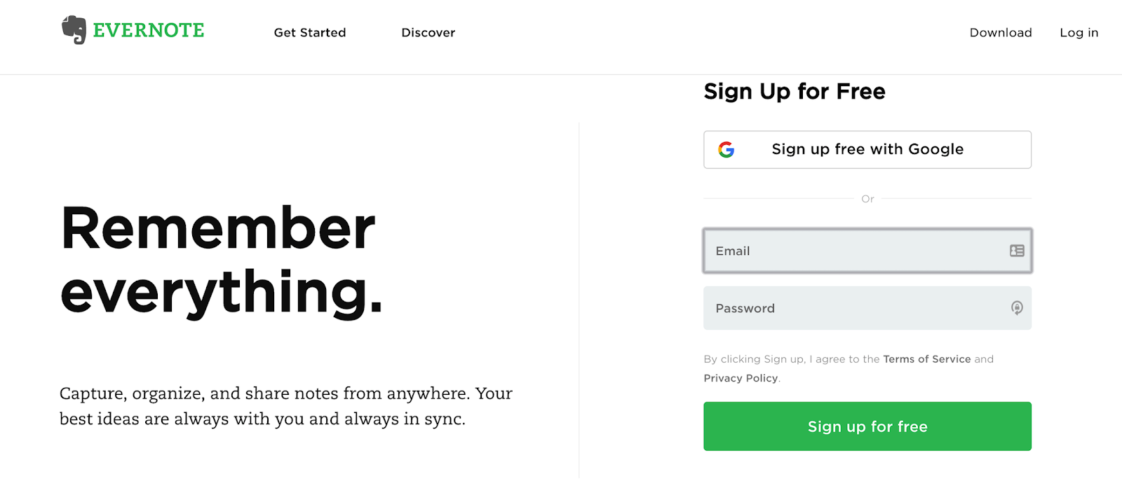
Copy that is short and succinct is what’s working now. Evernote does this well:
“Remember everything.” Just two compelling words and then a “sign up for free” option.
3. Place your CTAs within your content… wisely.
Pamela Vaughan, Hubspot’s marketing manager and strategist, used unique tracking URLs to analyze how their CTAs were performing among blog posts that were generating the most leads. The results were surprising.
End-of-post banner CTAs, which you would think would be eye-catching, were underperforming anchor-text CTAs. The end-of-post banners were contributing, on average, 6% of the total leads while the anchor text CTAs were providing between 47% and 93% of leads. Far better response and click-through rates.
The Hubspot team came up with a few theories about why the anchor text calls-to-action were working while the banner ones not so much. The anchor text CTAs appeared within the blog post, right where visitors needed them. That makes them easy to see, as many online viewers skim and never make it to the end of a post.
They also look like more useful content, an additional valuable resource, rather than another online ad to be ignored. You could share the same copy in a banner CTA as in an anchor text CTA, but the banner is more likely to be passed over because it looks like an ad. Think about it, when was the last time you really saw a sidebar or bottom of post ad? We tend to block them out.
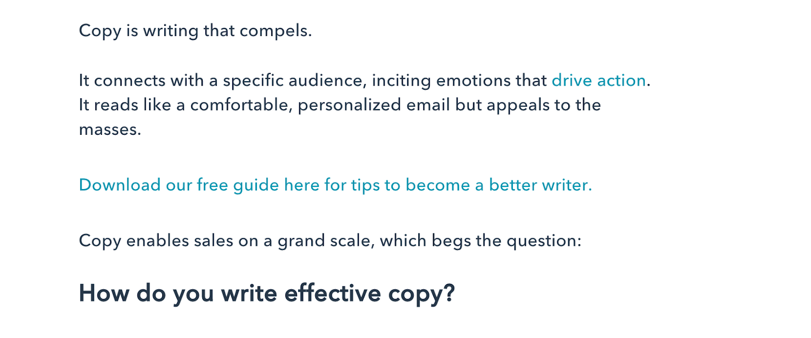
Here’s an example of Hubspot’s anchor text CTA method, from the post The Charles Bukowski Guide to Effective Copywriting:
Here you are invited to download the free guide right when you would be compelled to do so. This CTA offers value and makes it easy for readers to take action within the post.
How can you do the same for your readers?
Speak to your audience. Use compelling language that meets their needs and is in line with your brand, products, and service offerings. Make the copy clear, compelling and actionable. Then place your CTAs where they’re more contextually convenient for users and readers, not where they might feel invasive or like ads. Implement these tips and then try some testing to see what works best for your visitors.


