How the convergence of AI, cultural shifts, and evolving reader behavior is reshaping the art of the first impression
The relationship between readers and books has fundamentally changed. Walk into any bookstore today, and you’ll witness something remarkable: people aren’t just browsing — they’re performing. They photograph covers for Instagram stories, film TikTok reviews, and make split-second decisions based on visual appeal alone. This isn’t superficiality; it’s evolution.
As someone who has analyzed thousands of cover designs and their market performance, I’ve watched the industry undergo a seismic shift. The old rules — the ones that governed cover design for decades — are being rewritten by forces that extend far beyond traditional publishing. Today’s successful covers don’t just represent books; they participate in cultural conversations, leverage algorithmic psychology, and bridge the gap between digital discovery and emotional connection.

The Neuroscience of the Seven-Second Decision
Before diving into trends, we need to understand what actually happens when a potential reader encounters your cover. Neuroscientists have identified that book-buying decisions occur in two distinct phases: the initial seven-second visual processing window, followed by a longer consideration period that may last minutes or days.
During those crucial first seven seconds, the human brain is performing rapid pattern recognition. It’s asking fundamental questions: What genre is this? Who is this for? What experience am I being promised? The cover isn’t just competing with other books — it’s competing with every other stimulus in the visual environment, from smartphone notifications to storefront displays.
This understanding has profound implications for cover design. The most successful covers of 2025 aren’t necessarily the most beautiful or artistic; they’re the most cognitively efficient. They communicate their core message faster and more clearly than their competition.
Consider the phenomenon of “BookTok” — TikTok’s massive book community. Videos showcasing books regularly receive millions of views, but the average viewer spends less than three seconds evaluating each cover. The covers that perform best in this environment share a crucial characteristic: they’re instantly readable at thumbnail size while maintaining visual intrigue at full resolution.
Why Minimalism Won (And Why It’s Already Evolving)
The minimalist movement in book cover design wasn’t born from aesthetic preference — it emerged from necessity. As browsing shifted increasingly mobile-first, covers needed to work as tiny thumbnails on smartphone screens. The solution was radical simplification: bold typography, single focal points, and generous white space.
But here’s what most analyses miss: minimalism succeeded because it solved a technological problem, not because readers inherently prefer simple designs. Now that display technology has improved and attention patterns have adapted, we’re seeing the emergence of what I call “sophisticated minimalism” — designs that appear simple at first glance but reveal layers of complexity upon closer examination.
Take the cover of Hanya Yanagihara’s “To Paradise.” At thumbnail size, it reads as elegant typography against a soft background. But examine it closely, and you’ll discover subtle textural details, carefully considered color relationships, and typographic nuances that reward deeper engagement. This approach acknowledges that readers encounter covers in multiple contexts — first as thumbnails, later as physical objects or full-screen images.
The truly innovative covers of 2025 are designed with this dual-context reality in mind. They function as both billboards and art objects, optimized for both algorithmic discovery and intimate examination.
The AI Revolution: Collaboration, Not Replacement
The integration of AI into cover design represents the most significant technological shift since the transition from hand-lettering to digital typography. But contrary to popular narrative, AI isn’t replacing human designers — it’s fundamentally changing how design decisions are made.
The most sophisticated design teams now use AI as a rapid prototyping tool, generating dozens of concept variations in minutes rather than days. This acceleration allows for more extensive testing and iteration. Where a traditional design process might explore three or four concepts, AI-enhanced workflows can evaluate thirty or forty.
However, the real breakthrough isn’t in image generation — it’s in pattern recognition. AI tools can now analyze successful covers across genres and identify subtle visual patterns that human designers might miss. For example, AI analysis revealed that romance novels with hand-lettered titles outperform those with standard fonts by an average of 23% in click-through rates, but only when the lettering maintains specific weight and contrast ratios.
The challenge is knowing when to follow AI insights and when to ignore them. The most successful covers often deliberately violate established patterns to stand out in crowded markets. This requires human judgment that current AI cannot replicate.
I’ve worked with designers who use AI to generate what they call “constraint landscapes” — visual maps of what successful covers in a genre typically look like. They then deliberately design outside these constraints while maintaining just enough genre signaling to avoid confusing readers. It’s a sophisticated balance that requires both technological assistance and human intuition.
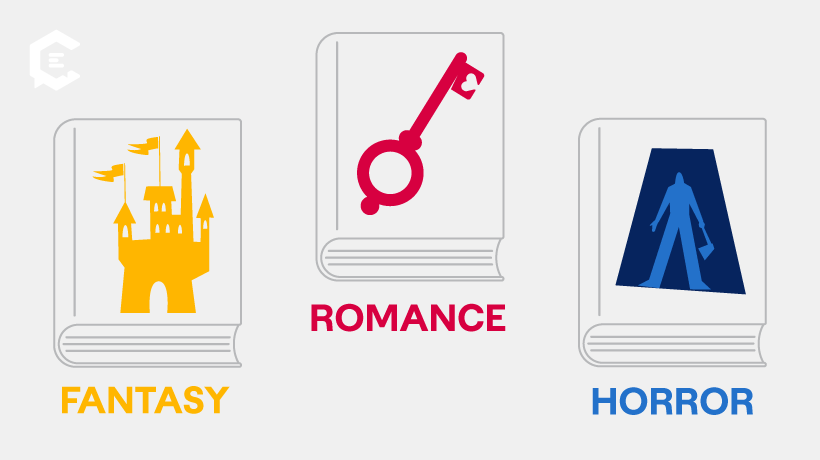
The Psychology of Genre Expectations
Genre conventions in cover design exist for powerful psychological reasons. When a reader seeks a fantasy novel, they’re not just looking for a story—they’re seeking a specific type of emotional experience. The visual cues that signal “fantasy” (particular fonts, color palettes, imagery) serve as psychological priming, preparing the reader’s mind for the experience ahead.
But genre conventions are also cultural constructs that evolve over time. What signaled “science fiction” in 1980 (chrome typography, starfields) feels dated today. Modern sci-fi covers increasingly borrow visual language from tech startups and contemporary art, reflecting the genre’s evolution from pulp adventure to serious literature.
The most interesting development in 2025 is the emergence of what I call “genre fluidity” in cover design. Books that genuinely cross genre boundaries — literary sci-fi, romantic fantasy, comedic horror — are experimenting with visual mashups that combine conventions from multiple genres. These hybrid approaches are risky but can be extraordinarily effective when executed skillfully.
For example, “Klara and the Sun” by Kazuo Ishiguro features a cover that combines literary fiction’s restraint with science fiction’s sense of wonder. The result signals serious literature to one audience while remaining accessible to genre readers — expanding the book’s potential market significantly.
The Cultural Context: Why Representation Matters More Than Ever
Book covers have always reflected cultural values, but social media has amplified their impact exponentially. A cover isn’t just seen by individual readers — it’s shared, discussed, and critiqued by entire communities. This visibility has created new responsibilities for designers and publishers.
The push for authentic representation in cover imagery isn’t just about social justice (though that’s crucial) — it’s about market expansion. Research consistently shows that readers from underrepresented groups are more likely to purchase books whose covers reflect their experiences. Moreover, covers featuring diverse characters often appeal to broader audiences, not narrower ones.
But representation is more complex than simply featuring diverse faces. It extends to artistic styles, cultural visual languages, and even color preferences that vary across different communities. For instance, Italian book covers often employ more dramatic typography and rich color palettes compared to Scandinavian minimalism, reflecting distinct cultural aesthetics that resonate with local readers. The most successful multicultural covers demonstrate deep understanding of the communities they’re designed to reach, often requiring collaboration between the designer and a cultural editor who can ensure authentic representation.
This cultural awareness is becoming a competitive advantage. Publishers who invest in authentic representation aren’t just doing the right thing morally — they’re positioning themselves for success in an increasingly diverse marketplace.
The Technology Stack: Tools That Actually Matter
The proliferation of design tools has created both opportunities and confusion. While dozens of new platforms emerge monthly, professional success still depends on mastering a core toolkit that balances power, reliability, and cost-effectiveness.
For AI-enhanced workflows, the most effective approach combines multiple tools rather than relying on any single platform. Professional designers typically use AI for initial concept generation (Midjourney for atmospheric imagery, Ideogram for text integration), then refine results in traditional software (Photoshop for manipulation, Illustrator for typography).
The key insight is that AI tools excel at generating raw material but require human curation to achieve professional quality. A typical professional workflow might generate fifty AI images, select three for development, then spend hours refining typography, color balance, and composition to achieve publication standards.
Budget-conscious authors can achieve surprisingly professional results using this hybrid approach, but it requires learning both AI prompting techniques and basic design principles. The most common mistake is assuming AI output is ready for publication without human refinement.
For authors working with limited budgets, platforms like Fiverr have democratized access to professional design services. The key is finding designers who specialize in your specific genre and have portfolios demonstrating understanding of current market trends. Many successful indie authors report excellent results working with Fiverr professionals who combine traditional design skills with AI-enhanced workflows.
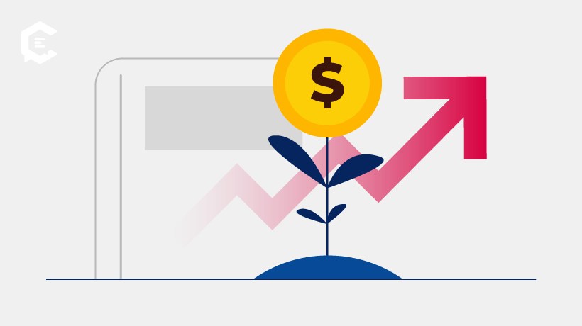
The Economics of Impact: What Investment Actually Returns
The economics of cover design are more complex than simple cost-benefit analysis suggests. A professionally designed cover isn’t just an expense — it’s a marketing investment that affects every subsequent promotional effort.
Data from indie authors who A/B tested different cover approaches reveals striking patterns. Books with professionally designed covers consistently outperform DIY alternatives, but the margin varies dramatically by genre. In romance and thriller categories, professional covers provide 200-400% return on investment. In literary fiction, the advantage is smaller but still significant.
However, the most expensive option isn’t always the most effective. The sweet spot for most authors appears to be working with mid-tier professionals who specialize in specific genres — platforms like Fiverr offer access to experienced cover designers at reasonable rates — rather than high-end generalists or bottom-tier services
The hidden value of professional design extends beyond sales. Quality covers improve organic reach on social media, increase the likelihood of influencer attention, and enhance author credibility in professional contexts. These benefits compound over time, making the initial investment more valuable than immediate sales figures suggest.
The Mistakes That Kill Sales (And How to Avoid Them)
After analyzing hundreds of underperforming covers, certain failure patterns emerge consistently. The most damaging isn’t poor artistic execution — it’s category confusion. A cover that beautifully represents the wrong genre will actively repel the intended audience while attracting readers who will be disappointed by the content.
The second most common failure is thumbnail illegibility. Covers that look stunning at full size but become incomprehensible at 150 pixels will struggle in digital marketplaces where most discovery happens. This problem is often invisible to designers working on large monitors, but becomes obvious when viewed on smartphones.
Typography mistakes represent the third major category of failure. Poor font choices don’t just look unprofessional — they unconsciously signal low quality to potential readers. The human brain processes typography faster than conscious thought, making font selection one of the most important design decisions.
The most subtle but equally damaging mistake is cultural tone-deafness. Covers that inadvertently invoke harmful stereotypes or fail to authentically represent the communities they depict can generate negative publicity that overwhelms positive word-of-mouth.
The Platform Paradox: Designing for Everywhere and Nowhere
Modern covers must function across radically different contexts: Amazon thumbnails, physical bookstore displays, Instagram posts, TikTok videos, and podcast promotional graphics. Each platform has different technical requirements, aesthetic preferences, and user behaviors.
The challenge is creating designs that work everywhere without being optimized for nowhere. The most successful approach is designing a “master” cover optimized for the most important sales channel, then creating platform-specific variations that maintain visual consistency while adapting to specific technical and cultural requirements.
For most authors, Amazon represents the primary sales channel, making mobile-first design essential. But authors with strong social media presence might prioritize Instagram compatibility, while those pursuing bookstore placement need designs that work in physical retail environments.
The key is understanding that “one size fits all” is no longer viable. Professional cover design now includes creating a family of related designs rather than a single image.
Looking Forward: The Trends That Will Define the Next Era
The most significant trend shaping cover design’s future isn’t visual — it’s behavioral. As attention spans fragment across multiple platforms and media types, covers must work harder to create an immediate emotional connection. This is driving evolution toward more psychologically sophisticated design approaches that leverage color psychology, compositional dynamics, and cultural signaling more precisely than ever before.
The second major trend is the democratization of professional-quality design through AI assistance. This levels the playing field between indie authors and traditional publishers, but it also raises the baseline quality expectations. Standing out now requires either exceptional execution or deliberate differentiation from AI-generated aesthetics.
The third trend is the internationalization of design languages. As global digital platforms expand access to diverse literary traditions, Western cover conventions are being enriched by visual approaches from other cultures. This cross-pollination is creating new hybrid aesthetics that appeal to international audiences.

The Future Is Human-AI Collaboration
The future of book cover design won’t be determined by technology alone — it will be shaped by how creatively humans learn to collaborate with artificial intelligence. The most successful practitioners will be those who understand both the capabilities and limitations of AI tools while maintaining the human insights that create emotional resonance.
This requires developing new skills: AI prompting becomes as important as color theory, algorithmic thinking complements artistic intuition, and cultural sensitivity guides technological application. The book cover designers who thrive will be those who embrace this hybrid approach rather than fighting against technological change.
The ultimate goal remains unchanged: creating visual experiences that honor the stories within while connecting authentically with readers who need those stories. Technology is simply providing new tools for this ancient art of visual storytelling.
As we move deeper into 2025, the books that succeed will be those whose covers understand this fundamental truth: in an attention-scarce world, the first impression isn’t just important — it’s everything. But that impression must be earned through sophisticated understanding of psychology, technology, culture, and craft.
The cover is no longer just packaging. It’s the opening line of your book’s conversation with the world.